Below is just my observations really (and a bit of a rant).
As a user of an Android (personal) and an iPhone (business) mobile telephones, I have access in the car to both Apple Car play (ACP) and Android Auto (AA). As my Iphone is usually in my laptop bag in the boot of the car, I usually (for the past few years) tend to use my Galaxy S9 via Android Auto to play either Spotify or Tune in Radio in the car.
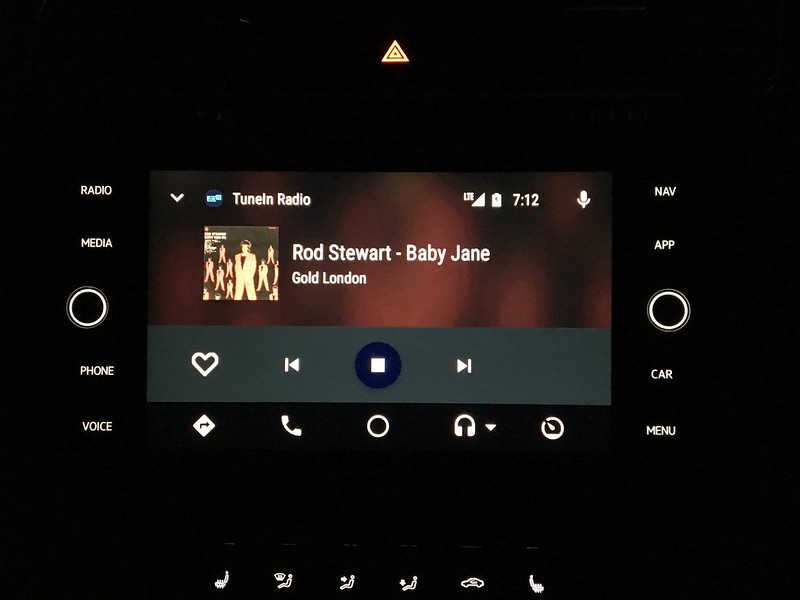
Well, as last night I'd found the iPhone cable from VW that was supplied with the car back in May last year, I thought for the first time I'd give Apple car play a try. Whilst from a functionality and speed point of view it seems a wash between both technologies (i.e. ACP and AA), I was amazed at the different approaches both took to the actual visual interface. On AA (especially with the latest update), it looks very polished and well laid out with cover art and fonts big enough to read at a glance, but not too large. However on ACP, it looks like the interface was designed by a 4 year old. There's no cover art to speak off (the background is so blurred as to not even be worthwhile), and the fonts massive.
Now I know that these systems are designed to be as safe as possible and to be used whilst on the move, so therefore have to be as simple and easy to read as possible, in my humble option Apple have taken this to extremes and the interface needs a serious work over. AA shows that an interface can be simple and easy to read but elegant at the same time. Anyone else think the same. I take it due to Apple's strict ring fencing, it's not possible to re-skin or modify ACP's interface ?
As an example, here's TuneIn Radio this morning on both systems. Think from now on I'll be sticking with AA.
Apple Car Play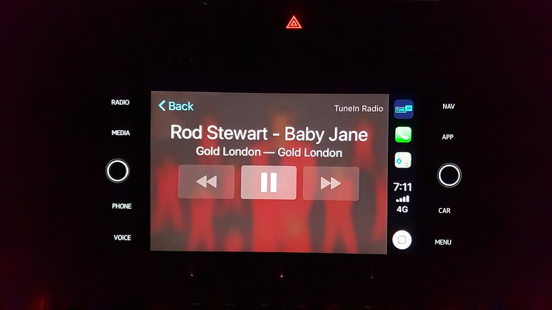 Android Auto